Friday 29 November 2013

Logo Analysis

Logo Analysis
Dreamworks comes across as a big budget production company that usually make quite happy children movies instead of anything full of horror or gore.
Dreamworks have set a bvery typecast image to their name as they have helped to produce films like madagascar, shrek and flushed away. This is probably why the logo of Dreamworks is full of nice fluffy clouds and alittle boy sat on the moon. It'a simple, peaceful and doesnt symbolise anything scary at all!


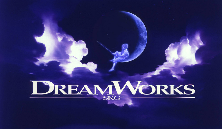
On the other hand, Lionsgate looks very eery and dark so its a production company you could imagine producing a thriller film. Lionsgates most recent big budget film was The Hunger Games and you can see how perfect the themed logo fits in with the entire genre of the movie so using something like this in my movie opening would be a lot more beneficial. If i used a logo like dreamworks it may make people confused on the genre of my movie and so i would not be making my ideas clear enough.          


Thrillers Moodboard


Wednesday 20 November 2013

Poster Analysis: The Dark Knight

Promotion of a movie:
The main purpose of a movie poster is to promote the latest movies in a way of pre-echoing but all around town. You can place them on the side of buses, on bus stops in magazines...basically anywhere. The poster gives you an initial indication of the genre and sub-genre and it attracts a specific sci-fi/fantasy/action thriller audience that they feel the poster appeals to and draws in. Most woman would label this as a typical "male film"as from the poster there isn't anything that would attract a typical female e.g. an attractive lead (batman is wearing a mask in this poster). Also having the list of very famous actors at the bottom usually reassures audiences that its going to be a good movie because actors like Morgan Freeman don't like to get associated with movies that don't have good scripts.

A burning building, surrounded by smoke which makes it seem mysterious. It also shows how destructive this film is and how it is not going to be a film about ponies.
The batman logo has been created on the side of a destroyed building, it looks like something has hit it. The fire that fills the logo shows its a key symbol to the poster as it lights it up and draws your attention to it straight away. Because this bat symbol is so well known you would only have to glance at this poster for you to know it's for a batman movie, well that and Batman is stood right in front of the building. Bits of rubble is falling to the ground but batman is just stood in the middle of all the chaos. This is all known as iconography and conventions. This shows you he is the character that fights evil and has to do all the dirty work; its almost like he's invincible.


"Welcome to a world without rules" tell you that things could get violent because with no rules things can get out of hand quickly. I feel like this poster is showing you  a sneak preview of the end of the movie, on how the villain is defeated and so this might get more people talking about the poster and therefore the movie. The title of the movie is quite plain but it is still bold and stands out! Nowhere on the poster does it actually say "Batman" because the advertising agencies immedialtey know everyone is anticipating this movie and would recognise the comic book based character instantly. He does not need to be branded on the front.
The layout of the poster shows you its more modern, unlike the other batman posters.

Opening Credits - Sweeney Todd


- The original movie productions logo has been changed to fit into the theme of the movie.
- All dark colours even when the sky is being shown.
- Dark sinister music in the background tells you instantly that this isn't going to be a happy movie.
- They have a blood trail moving around in the title sequence that makes you on edge from the beginning.
- The logo "dream works" seems to linger on the screen for longer that it should.
- The whole clip if filled with mist and rotting pictures, making everything seem creepier than it is.

Spiderman 2 Opening Credits


- The colour red that usually would symbolizes blood and danger.

- Deep slow paced music that builds up as the opening titles draw to a close.
- Images are playing in the background from the previous movie, so even though this is a good idea because it reminds you of what happens you end up watching this instead of all the mentions of people who helped create the movie etc. However they do make sure that the actors names etc. stretch out across the moving images so it grabs your attention away.

Panic Room opening sequence.


- Typical moving images of buildings, streets and landscapes which occur quite frequently in opening sequences of Thriller movies.
- The information about the producer etc looks 3d as its placed between buildings
- Dark, eery music playing in the background tells you the type of movie its going to be straight away, suspenseful from the beginning.
- The writing stays on the screen for a perfect amount of time so that the audience feels satisfied they have read it, also there is nothing going on to distract them from reading it.

Friday 15 November 2013

BBFC: British Film Certificates

BBFC: British Film Certificate


The U symbol stands for Universal. A U film should be suitable for audiences aged four years and over. 
  • At U we only allow very mild bad language (eg ‘damn’ and ‘hell’). Occasionally, bad language such as ‘bloody’ or ‘bugger’ may be included, where justified by the context.
  • Characters may be seen kissing or cuddling and there may be references to sexual behaviour (ie to ‘making love’). However, there will be no overt focus on sexual behaviour, language or innuendo.
  • A U film may include brief fight scenes or moments where characters are placed in danger. However, moments of emotional stress or threat will be quickly resolved and the outcome will be reassuring.


PG stands for Parental Guidance. This means a film is suitable for general viewing, but some scenes may be unsuitable for younger children. A PG film should not disturb a child aged around eight or older. Parents should consider whether the content might upset younger or more sensitive children. 
  •  PG works can explore challenging issues such as domestic violence, bereavement or racism.
  • There may be mild bad language (such as ‘shit’ or ‘son of a bitch’) in a PG film, but the context and delivery are always important. For example, if the language is used aggressively or if there is too much bad language, a work may be passed at the next category.
  • References to sex are acceptable if the activity talked about or shown is implied and lacking in detail. In addition, if a child is unlikely to understand a reference, we may allow it at PG. Comedy can also often lessen the impact of sex references and innuendo.
There shouldn't be any details of violence in a PG film, so while there might be some blood, we would not see how the injury was inflicted in strong detail. Violence is generally more acceptable in a historical or fantasy setting, because of the distancing that this provides.


12A means that anyone aged 12 or over can go and see the film unaccompanied. The A stands for 'accompanied' and so they have to take an adult over the age of 18. to watch it with them. The difference between 12 and 12A is that the 12 certificate is just for videos, DVDs and Blu-rays whereas 12A is for films at the cinema only.
  • The certificate office states that there may be strong language (eg 'f***') at 12 or 12A, but it must be infrequent. The context of the strong language is important.
  • Sex may be briefly and discreetly portrayed at 12 or 12A. Verbal sex references should not go beyond what is suitable for young teenagers.
Dangerous behaviour (for example hanging, suicide and self-harming) may be present in 12 or 12A but will not dwell on detail which could be copied or present those activities as pain or harm free so people wouldn't try and impersonate them or feel they want to do it too.
Discrimination is not allowed.
There may be infrequent sight of drugs misuse in a 12 or a 12A but the portrayal should not be glamorised or provide instructional details on how to take or get drugs.


No-one under 15 is allowed to see a 15 film at the cinema or buy/rent a ‘15’ rated DVD.  15 rated works are not suitable for children under 15 years of age.
  • Potentially a repetitive use of the word (F***) and can use more offensive words once or twice.
  • They can use racist, discriminatory or homophobic language throughout.
  • At 15 sexual activity can be portrayed, as long as there is no strong or graphic detail. Some sex scenes can be quite long at this category and may involve some nudity and movement. Though nudity may be allowed in a sexual context there should be no strong detail.
  • Many horror films are rated 15. At 15 there can be strong threat and menace (as long as it is not sadistic or sexualised), although the strongest gory images are unlikely to be acceptable.
  • There can be a wide use of the theme of violence as long as how the injury was inflicted isn't dwelled on.


Films rated 18 are for adults. No-one under 18 is allowed to see an 18 film at the cinema or buy/rent an 18 rated DVD. No 18 rated works are suitable for children.
  • There is no limit of the strength of bad words nor is there any limit on how many times you can use them.
  • There can be strong and detailed portrayals of sex at 18, including full nudity. There are no constraints on nudity in a non-sexual or educational context.
  • Voilence can be portrayed in strong detailed, in any way and can be as graphic as the producers want it to be.
  • There is no limit on drug taking and all horror movies which includes large amounts of gore are passed as a 18 straight away.


Wednesday 13 November 2013

Opening Title Analysis

title_pulp_fiction_blu-ray.jpg
Bold, yellow and black, all things you could associate with typical thrillers.
imgres.jpg
Big bold black letters seems quite plain and simple, however you wouldn't mistake the font as being something used in a fairy-tale.
imgres.jpg
The main title is wrote in red to symbol blood or danger. The island is kept in the darkness to make it look creepier.
imgres.jpg
The font is again in red to symbolize death but this time it almost looks like it is either being smudged away or it is rotting/decaying. These things can be associated with horror and crime, two good concoctions to make a good thriller, as you are constantly on edge.

imgres.jpg
Black background again but this time with conventional white writing. The cracking image in the background creates a scary atmosphere.


Friday 8 November 2013

Conventions of thrillers

Conventions of thrillers

- Fast paced suspenseful music.
- Dark images, nothing happy and optimistic. Thunder clouds, rain or graveyards and hospitals.
- Lots of action scenes. E.g. car chases, fights, lots of movement.
- Usually lots of weapons.
- The main story line consists of the 'hero' going on  quest or trying to save someone or the 'villains' trying to find something because they think it belongs to them or because they will get great wealth or power from it.
- Usually you see the main character running from car chases, explosions or from bad guys.


imgres.jpg
 Tom Cruise- Running from car chases, explosions or bad guys.
url.jpg
Scenes usually shot mostly in the dark (night time).


ExplosionsLowLightingCarsWeaponsTensionCrimeSuspenseChasesDarknessFootStepsTempoSHeartbeatsSoundsAnticipationNightPlotsFireThunderGunGraveyardEeryGrippingFightingMistBloodComplicatedIllusionBuildupEnigmaGuiltyEvilRepresentationInnocenceAngerRevengeScreamsMaleGazePowerIndependanceCreativeUniquePhyscialStengthProtagonistVillainHeroPainDestructionObjectifyingDeathStruggleMissionRun